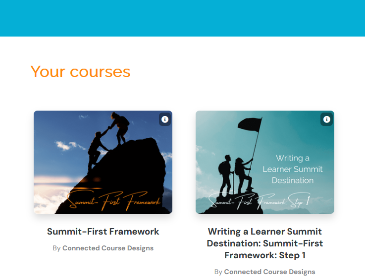
Two Summit-First Framework courses as displayed in the Learn course platform by ThriveCart
What platform should I put my content in?
The platform choice for where your content will “live” is possibly the most difficult part of the course creation process. It serves as your learners’ Trail Guide. It’s the place from which they access your course content and start their journey to the summit, following the trail markers you’ve placed with a backpack full of resources.
How that platform functions matters, both from a student user perspective and for you as the creator who has to put all the content in and manage it.
Have you ever used an online course or website menu, clicking deeper and deeper to find a specific topic, only for the needed category to be absent at the end of all those clicks? Bonus points on the frustration scale if you also had to back out to get to the starting point instead of just being able to start over at the highest menu level.
Poor navigation like that is the kind of major design flaw you want to avoid – Let’s ensure our learners don’t get lost!
Sometimes these are creator errors – the content wasn’t input into the system correctly to make for a good user experience. Other times, they are limitations of the platform features and capabilities. (To read more about navigation design, check out The Four Critical Points of Course Navigation post.)
We’ve looked at the first four steps of the Summit-First Framework in this Series:
That brings us to today’s topic, Step 5: Trail Guides.
Once you have gathered your content and planned it out in the Trail Map, it’s time to create the Trail Guide that your learners use to take them from course outline to the end summit goal; this requires two steps.
The first part is creating the full content from the map. You’ll need to write out the text-based content in full, create your multimedia lessons (audio, video, presentations, etc.), choose your graphics (images, diagrams, etc.), and create your supporting resources (graphics, charts, check-you-understanding questions, etc.).
The second part is deciding how to deliver the content to your learners and getting the access set up. Options range from the super simple and inexpensive to more complex and costly. So many choices exist!
You can find plenty of comparison lists of features of course platforms, but they don’t explain how they may or may not affect your course design. I give you the design guidance you need here to make your decision about where your course content will “live.”
Learner Features and Creator Features to Look for
Your first consideration should always be your learner. You want to design learner-centered experiences that focus on the needs of the learner. Let’s look at that first.
Design-supported Features
As you review features of a course home platform, ask yourself how each feature can be used to support the learners’ experience.From my experience, these are the top design elements to think about as you review platform features.
- Navigation
- Lesson structure options
- Multimedia options
- Accessibility
- Access
- Mobile-responsive design and dedicated mobile app
Today, we’ll explore one of these – navigation, which I’ve previously written about in The Four Critical Poins of Course Navigation post. A significant part of navigation is the lesson structure options it gives you. How many levels of nesting are possible?
For example, one level could look like this for a Summit-First Framework course with 5 modules:
One level of modules could look like this:
- M1: Learner Summit Destination
- M2: Trail Markers
- M3: Backpack Checklist
- M4: Trail Map
- M5: Trail Guide
Two levels could look like this (I am just using the first module for the example; each module would have their own lessons):
- Module 1: Learner Summit Destination
- Lesson 1: Introduction to learner summit destinations
- Lesson 2: How to create a learner summit destination
- Lesson 3: How to write a learner summit destination
Three levels could look like this:
Module 1: Learner Summit Destination
- Welcome video (3:00 mins)
- Guide (PDF, 4 pgs)
- Course Transcript (PDF, 20 pgs)
- Lesson 1: Introduction to learner summit destinations
- Video lesson (5 mins)
- Lesson Transcript (PDF, 4 pgs)
- Lesson 2: How to create a learner summit destination
- Video lesson (5 mins)
- Learner Summit Destination Writing Guide (PDF, 4 pgs)
- Lesson Transcript (PDF, 4 pgs)
- Lesson 3: How to write a learner summit destination
- Video lesson 1: CAMP Framework (7 mins)
- Video lesson 2: Finalizing the draft (4 mins)
- Lesson Transcript (PDF, 7 pgs)
Breaking out and making visible all of the content hierarchical levels allows the learner to:
- Understand the scope of content covered
- Easily see how long the course parts take all together
- See what media the course content uses
- Plan working through the course based on time and content format
- Easily find a specific resource such as the Learner Summit Destination Writing Guide
I’ll discuss how to review for more features from a design perspective in the upcoming Trail Guides course.
Creator-supported Features
You also need to consider yourself. Some things to have at the top of your list are:
- Ease of learner submitted payment
- Processing of payment from the platform to you
- Learner access (will you have to help learners get into their courses once purchased?)
- Searchability
Let’s look at searchability for a moment. Most platforms available to online solopreneurs keep your courses separate from those of other creators. You have your own page of courses for learners to access once purchased. With some platforms such as Udemy, Coursera, and Gumroad, your course has the potential to appear in a search of courses on your topic.
This blog post does not cover all the differences between platforms that allow searches across multiple creators’ courses and those that don’t. For now, know that you want to consider if you want your courses hosted in a place where learners can search for courses by topic or if you want your courses independent of other courses. (Spoiler alert: most – but not all - solopreneurs opt for keeping their course content separate.)
I’ll discuss more creator-focused features in the upcoming Trail Guides course.
Course Platform Options to Consider from Thinkific to Gumroad
When I first began researching platform options for my courses, I landed on Thinkific because it rates high for offering a rich set of design features, particularly control over course structure levels which we discussed above. Teachable was high on the list as well because it is reportedly fairly easy to use.
I have avoided Kajabi because I’ve had terrible experiences with it as a user and other creators have told me it’s difficult from a creator perspective as well.
Then I learned that Learn comes with ThriveCart and has decent features for design. Since ThriveCart is part of my system already, this is where my courses are currently housed. But, I’m still deciding. I’m not happy with only having 2 levels of structure for navigation and presentation of content modules and lessons, and they don’t offer quizzes that can be used for check-your-understanding interactivity.
I also have access to Thrive Apprentice through ThriveThemes which reportedly has the level of structure I seek and the quiz option. I’ll be trying it out soon and I’ll be reporting back to you.
Of all the others, I either only have experience as a user or none, but I’m always exploring. I’m intrigued by Gumroad which seems like a solid option for those with just one course who are just starting out and need just the basics. I’ll be checking it out as well and reporting back likely via my email newsletter as I experiment with it, Thrive Apprentice, and others.
Making the Course Platform Decision
If you’re just starting out on a shoestring budget, remember that you can deliver courses without a platform.
You could deliver a text-based course via email. (These can be surprisingly effective and well-received by learners when designed well.)
You can also house all of the course elements on a cloud server such as Google Drive or DropBox and provide the links to learners. (Of course, anyone with those links will have access to the content so consider those implications before going that route.)
Don’t get distracted by course platform feature bells and whistles which can be slickly marketed. Instead, assess each feature based on whether it supports effective course design to help your learners succeed.
To date, I’ve only used a handful of the platforms; as I have more experience building with them, I’ll provide more detailed information for you in my email newsletter. (You can subscribe using the form below.) Join me as I explore these platforms in real-time, sharing my successes and challenges, as well as the strengths and weaknesses of each platform’s design functionality.
Want a fillable worksheet and guide?
In the free Summit-First Framework course, I provide you with a fillable worksheet and form to guide you through all 5 steps. If you haven’t registered yet, you can do by filling out the form below.
Would you like more guidance on how to create your Trail Guide and choose a course delivery system?
Watch for the launch of the course Trail Guides: Summit-First Framework Step 5.
Sign up for my mailing list below to know when new courses are available.

